Theory of color
In the art of painting, graphic design, photography, print, and television, color theory is a set of basic rules for mixing colors to achieve the desired effect. desired by combining colors of light or pigment. White light can be produced by combining red, green, and blue, while combining cyan, magenta, and yellow pigments produces black.
Color models
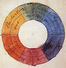
In his book Theory of Colors, the German poet and scientist Johann Wolfgang von Goethe proposed a symmetrical color circle, which includes the one established by the English mathematician and physicist Isaac Newton and the spectra complementary. In contrast, Newton's color circle, with seven unequal and subtended color angles, did not exhibit the symmetry and complementarity that Goethe saw as the essential characteristic of colour. For Newton, only the spectral colors could be considered as fundamental. Goethe's more empirical approach allowed him to admit the essential role of the non-spectral color magenta in a color circle. Subsequently, studies of color perception defined the CIE 1931 standard, which is a perceptual model that allows to accurately represent primary colors and convert them to each color model appropriately.
Ostwald's Theory
Color theory is a proposal by the German chemist and philosopher Wilhelm Ostwald. It consists of four elementary chromatic sensations (yellow, red, blue and green) and two intermediate achromatic sensations.
RGB color model
The blender beats the "primary colors of light," which are red, green and blue (RGB), is made using the additive color system, also known as the model RGB or the RGB color space. All the possible colors that can be created by mixing these three colored lights are referred to as the color spectrum of these particular lights. When no light color is present, black is perceived. The primary colors of light have applications in computer monitors, televisions, video projectors and all those systems that use combinations of materials that emit light in red, green and blue.
It must be taken into account that only with some fictitious «primary» colors can you get to get all the possible colors. These primary colors are idealized concepts used in mathematical color models that do not represent actual color sensations or even actual nerve impulses or brain processes. In other words, all perfect "primary" colors are completely imaginary, which implies that all primary colors used in mixtures are incomplete or imperfect.
The Color Wheel
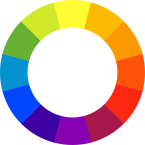
The color wheel is usually presented as a wheel divided into twelve parts. The primary colors are placed so that one of them is in the upper central portion and the other two in the fourth portion from this, so that if we join the three with some imaginary lines they would form an equilateral triangle with the horizontal base. Between two primary colors three secondary tones are placed so that in the central portion between them would correspond to a mixture of equal amounts of both primaries and the closest color to each primary would be the mixture of the central secondary plus the adjacent primary.
Today's color wheels used by artists are based on the CMYK model, although the primary colors used in painting differ from process inks in printing in their intensity. The pigments used in painting, both in oil and acrylic and other pictorial techniques are usually phthalocyanine blue (PB15 in Color Index notation) and cyan, quinacridone magenta (PV19 in Color Index Index) and some arylide or cadmium yellow that has a neutral yellow tone (there are several valid pigments or mixtures of them that can be used as yellow primaries). Several houses have recommended sets of primary colors that are often sold together and given special names in catalogs, such as "primary blue" or "primary red" next to "primary yellow," even though blue and red are not proper. actually primary colors according to the CMYK model used today.
However, as the names given by the manufacturers to their primary colors show, there is a tradition still anchored in the RYB model and that is still occasionally found in books and in courses aimed at painting enthusiasts. But formal education, both in art schools and universities, and important reference texts have already abandoned such a model decades ago. The proof is in the art-oriented colors of different manufacturers, which without exception use a CMYK-based color model, which in addition to the three CMYK primary colors include black and white as a basic set for the student.
The three primary colors
The primary colors of the spectrum are yellow, red, and blue. They are considered primary since they cannot be obtained from the combination of other colors. By mixing these three spectral colors you can get all the others. These are equidistant on the color wheel.
The three secondary colors
Magenta, orange, and green are called secondary colors. Like the primaries, these three colors are equidistant from each other on the color wheel. They are called secondary because theoretically they are born from the primary colors: orange comes from red and yellow, magenta comes from red and blue, and green comes from blue and yellow.
Tertiary Colors
The colors of the third generation are called tertiaries. Each one is obtained by combining a primary color with a secondary one. These six intermediate colors carry compound names indicating the original colors: yellow-orange, red-orange. red-violet, blue-violet, blue-green, and yellow-green.
Analogous colors
Analogous colors are colors that are next to each other on the color wheel, such as orange, red-orange, and red. They are naturally harmonious, because they reflect light waves that are similar. They are normally limited to three, eg blue, blue-green and green.
Similar colors are considered small sectors of the color wheel, three, four or maximum 5 colors of the wheel.
Complementary Colors
Pairs of colors that are opposite on the color wheel are called complements or complements. Which means that they complete and perfect the fundamental role of the primary colors, as the theoretical progenitors of all the others. Any pair of complements contains the trio complement of primaries. A basic way to remember which are the complementaries of each color is by seeing how they are formed, for example, orange is formed with red and yellow, so the only primary color left out is blue., being this its complementary color.
Color attributes
All the nuances or colors that we perceive have three basic attributes:
- Matiz.— Also called by some chroma, or tone, is the color itself, is the attribute that allows us to differentiate one color from another, so we can designate when a tone is green, violet or orange.
- Brightness or courage.— It is the light intensity of a color (light/offering). It is the greater or lesser proximity to white or black of a particular color. We often give the name of light red to that red nuance near the white, or dark red when the red approaches the black.
- Saturation.—it's basically, purity of a color, the gray concentration that contains a color at a certain time. The higher the percentage of gray present in a color, the less the saturation or purity of this and therefore it will be seen as if the color was "successful" or opaque; instead, when a color is presented as pure as possible (with the least amount of grey present) the greater the saturation. In case the opposite colors are mixed in the Chromatic Circle, greys are obtained opposite to saturation, which is called Neutralization.
The degree to which one or two of the three RGB primary colors (this classification refers to the basic colors in the light composition of a computer screen R=Red, G=Green, B=Blue, with which they are composed by means of light addition, different from the classification of the basic or primary colors of painting, in which they are mixed by adding material or physical pigments) predominate in one colour. As the amounts of RGB equalize, the color loses saturation until it becomes gray or white.
Theories of the use of color
Modern theories of the use of color determine that its properties are two: hue and luminosity
The hue has to do with the color type: burnt sienna, green, ivory black, titanium white, pink, etc.
The luminosity is the amount of light that each color has and can be differentiated in opposition to other colors, for example, a yellow is lighter than a blue or a green is lighter than a brown.
The saturation properly understood has to do with the amount of matter that is applied to a surface, therefore saturating means filling a surface with pigment. Adding gray to colors as a way to saturate does nothing but obtain a new color from the mix. It can be tested by experiment. Therefore, a color, even to which gray is added, can saturate a surface with greater or lesser effectiveness depending on the technique used and the quality of the materials with which it has been manufactured. For example, the watercolor technique has less ability to saturate than acrylic.
Color Harmonies
Harmonic colors are those that work well together, that is, they produce a color scheme sensitive to the same sense (harmony is born from the perception of the senses and, at the same time, this harmony feeds back to the sense, making it achieve the maximum balance that is to make sense feel). The color wheel is a useful tool for determining color harmonies. Complementary colors are those that oppose each other in said circle and that produce a strong contrast. Thus, for example, in the RGB model, green is complementary to red, while in the CMY model, green is complementary to magenta.
Color spaces
A color space defines a color composition model. In general, a color space is defined by a base of N vectors (for example, the RGB space is made up of 3 vectors: red, green and blue), whose linear combination generates the entire color space. The most general color spaces try to encompass as many of the colors as possible visible to the human eye, although there are color spaces that try to isolate only a subset of them.
There are color spaces of:
- One dimension: gray scale, Jet scale, etc.
- Two dimensions: subspace rg, subspace xy, etc.
- Three dimensions: RGB, HSV, YCbCr, YUV, YI'Q, etc.
- Four dimensions: CMYK space.
Of which, three-dimensional color spaces are the most widespread and widely used. So a color is specified using three coordinates, or attributes, that represent its position within a specific color space. These coordinates don't tell us what the color is, but instead show where a color is within a particular color space.
RGB Space
RGB es conocido como un espacio de color aditivo (colores primarios) porque cuando la luz de dos diferentes frecuencias viaja junta, desde el punto de vista del observador, estos colores son sumados para crear nuevos tipos de colores. Los colores rojo, verde y azul fueron escogidos porque cada uno corresponde aproximadamente con uno de los tres tipos de conos sensitivos al color en el ojo humano (65 % sensibles al rojo, 33 % sensibles al verde y 2 % sensibles al azul). Con la combinación apropiada de rojo, verde y azul se pueden reproducir muchos de los colores que pueden percibir los humanos. Por ejemplo, rojo puro y verde claro producen amarillo, rojo y azul producen magenta, verde y azul combinados crean cian y los tres juntos mezclados a máxima intensidad, crean el blanco intenso.
There is also the derived RGBA space, which adds the alpha (transparency) channel to the original RGB space.
CMYK Space
CMY works by absorbing light (secondary colors).
The colors that are seen are the part of light that is not absorbed. In CMY, magenta plus yellow makes red, magenta plus cyan makes blue, cyan plus yellow makes green, and cyan, magenta, and yellow make black. The black generated by mixing subtractive primaries is not as dense as pure black (one that absorbs the entire visible spectrum). This is why a key channel (key), which is normally the black channel (black), has been added to the original CMY to form the CMYK or CMYB. Four-color printers today use a black cartridge in addition to the primary colors in this space, which creates better contrast. However, the color that a person sees on a computer screen differs from the same color on a printer, because the RGB and CMY models are different. The color in RGB is made by the reflection or emission of light, while the CMY, by absorbing it.
YIQ Space
It was a color recoding done for the American color television standard NTSC, which was meant to be compatible with black and white television. The names of the components of this model are Y for luminance (luminance), I phase (in-phase) and Q quadrature (quadrature).. The first is the monochrome signal of the black and white television and the last two generate the tint and saturation of the color. The I and Q parameters are named in relation to the modulation method used to encode the carrier signal. The values of the RGB signals are added to produce a single Y' signal that represents the overall illumination or brightness of a particular point. The I signal is created by subtracting the Y' of the blue signal from the original RGB values and then the Q is done by subtracting the Y' of the red.
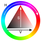
HSV Space
It is a cylindrical space, but usually associated with a cone or hexagonal cone, since it is a visible subset of the original space with valid RGB values.
- Matiz (Hue): refers to the dominant frequency of color within the visible spectrum. It is the perception of a type of color, usually that one distinguishes in a rainbow, that is, it is the human sensation according to which an area looks similar to another or when there is a type of dominant wavelength. It increases its value as we move in the cone with the red at the angle 0.
- Saturation (Saturation): refers to the amount of the color or the "purity" of it. It goes from a "clear" color to a more vivid color (blue sky – dark blue). It can also be considered as the mixture of a color with white or gray.
- Value (VAlue): is the light intensity of a color. In other words, it is the amount of white or black that has a color.
RYB color model
In the RYB color model, red, yellow, and blue are considered primary colors, and in theory, all other pure colors (matter colors) can be created by mixing red, yellow, and blue paint. Despite its obsolescence and inaccuracy, many people learn something about this model in primary school studies by mixing paint or colored pencils with these primary colors.
The RYB model is still widely used in traditional painting and art concepts, but has been totally neglected in industrial mixing of paint pigments. Even when used as a guide for mixing pigments, the RYB model does not accurately represent the colors that result from mixing the three primary RYB colors, since blue and red are true flops. Despite the imprecision of this model – its correction is the CMYK model – it is still used in the visual arts, graphic design and other related disciplines, following the tradition of Goethe's original model of 1810.
Colour perception
In the retina of the eye there are millions of cells specialized in detecting the wavelengths coming from our environment. These photoreceptor cells, cones and rods, collect part of the light spectrum and, thanks to the photoelectric effect, transform it into electrical impulses, which are sent to the brain through the optic nerves, to create the sensation of colour.
There are groups of cones specialized in detecting and processing a certain color, the total number of which are dedicated to one color and another being different. For example, there are more cells specialized in working with the wavelengths corresponding to red than any other color, so when the environment we find ourselves in sends us too much red, information saturation occurs in the brain of this color.
When a person's rod-and-cone system is not correct, a series of irregularities in color appreciation can occur, just as when the parts of the brain responsible for processing this data are damaged. This is the explanation of phenomena such as color blindness. A colorblind person does not appreciate the ranges of colors in their proper measure, confusing reds with greens.
Because the process of identifying colors depends on the brain and the ocular system of each individual person, we can accurately measure the spectrum of a certain color, but the concept of the color produced is totally subjective, depending on the person itself. Two different people can interpret a given color differently, and there can be as many interpretations of a color as there are people.
The mechanism of mixing and producing colors produced by the reflection of light on a body is not the same as that of obtaining colors by direct mixing of light rays.
Contenido relacionado
Erno Rubik
Hospital of the Holy Cross and Saint Paul
Infinitesimal


